Ashes Archives (CMS / Wordpress / html & Css Project)
Self Directed Project
Overview
This Project was centred around using a CMS system to create a website, that users with not much technical experience could still edit and change certain content on the website. For my website I choose to create a historical website about the cricket series (The Ashes), it was important to lay out the content in a clear manner across devices. We also did a rapid draft of a coded output of the final design.
Year
2024
Role
UX-Researcher, Ui Designer
Understanding The Problem
Understanding:
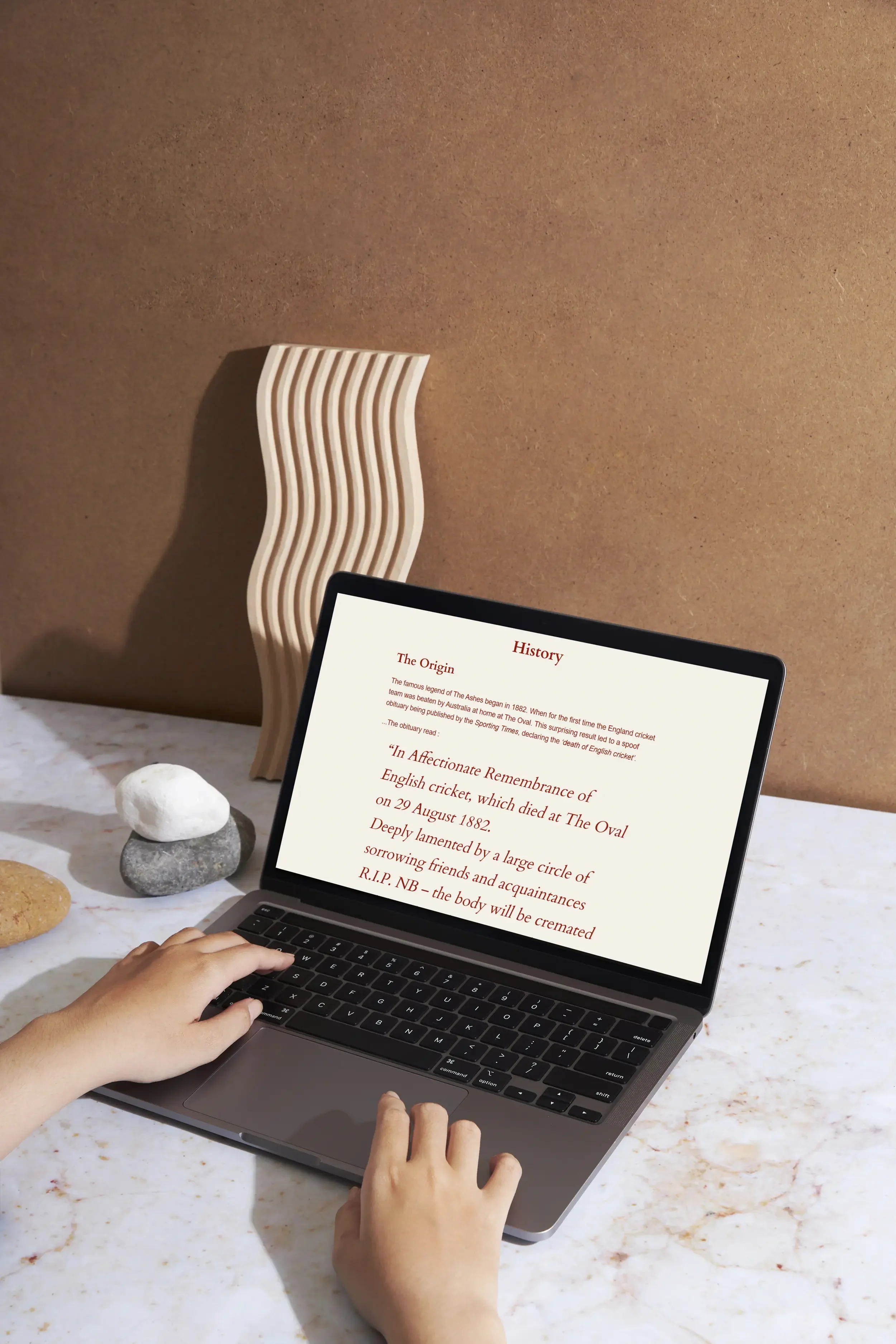
Usually, The Ashes history is found in bits and pieces across the web, with outdated designs and text-heavy sites that make the true story of the tournament hard to find. Through a competitor analysis, I quickly realized that most modern sports history websites focused on data storage over a transparent, intuitive user experience.
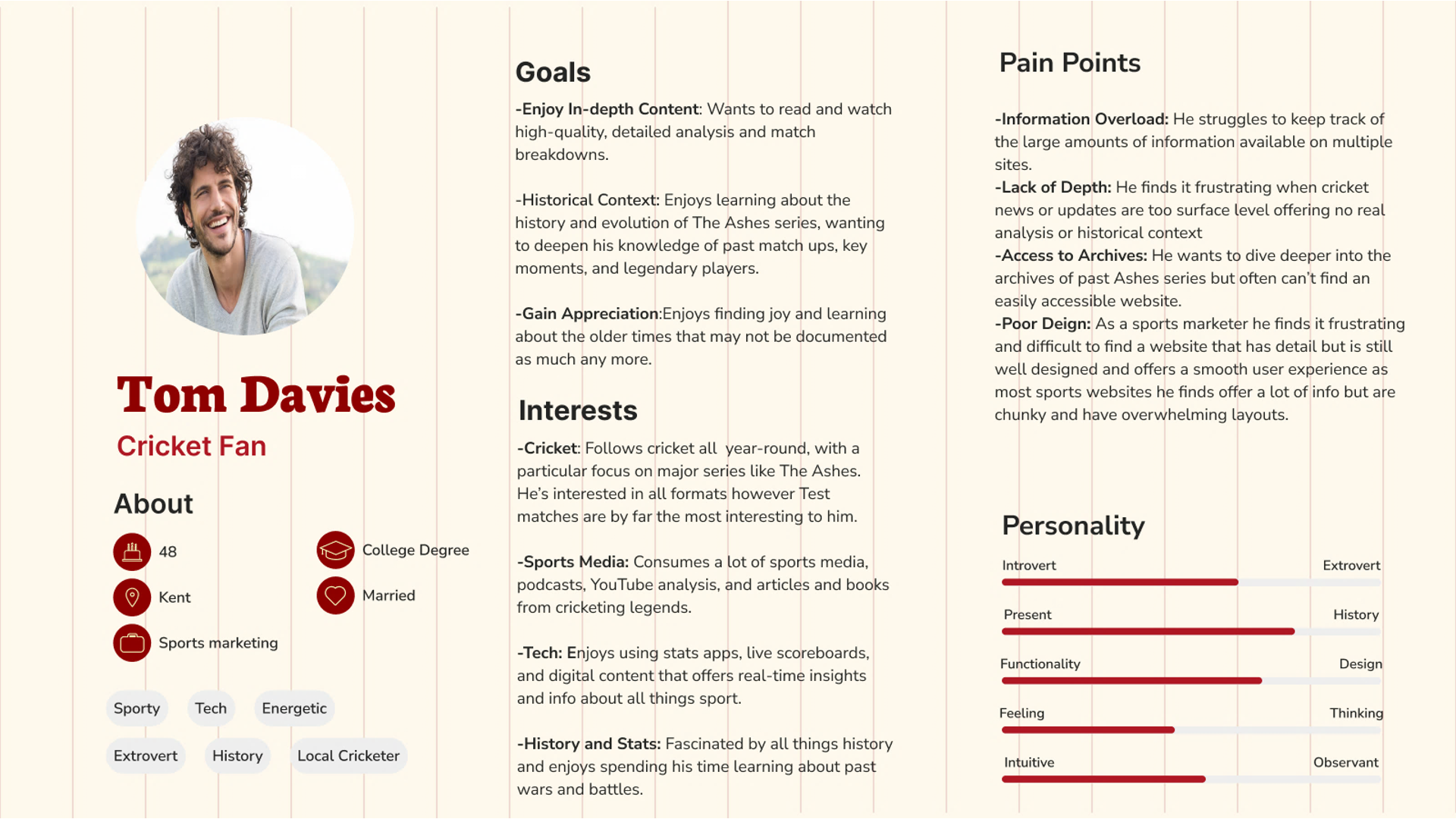
First, I defined a few personas based on the typical fan, not expert users, to understand for whom I was designing. That really clarified what users actually need: simple navigation, visual storytelling, and quick access to the key moments without feeling overwhelmed.
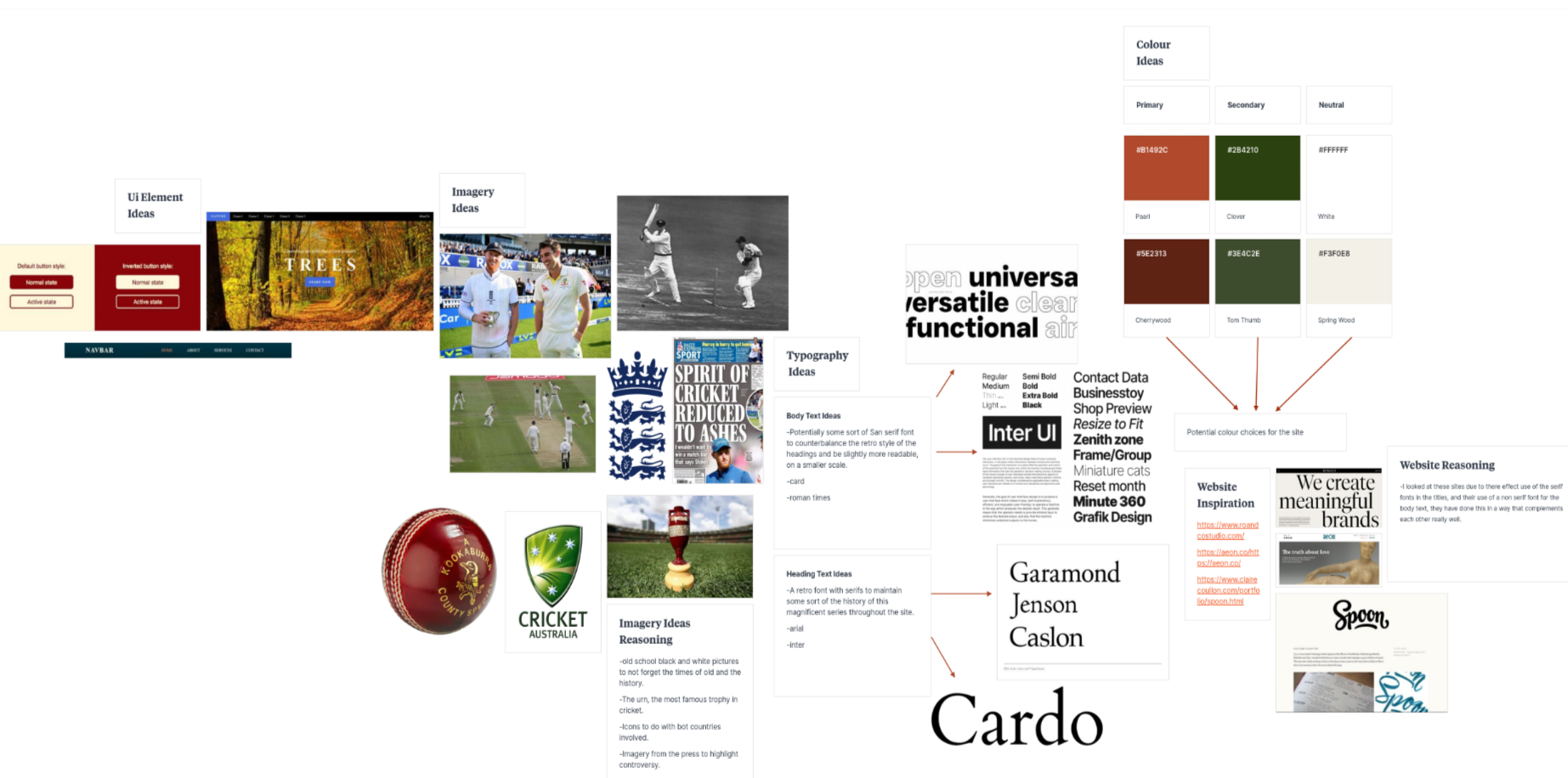
The moodboard then set the emotional tone, showcasing themes of heritage, rivalry, and timelessness.
Core issue:
There is currently no single, user-friendly, visually engaging platform that presents the Ashes' history to fans like my persona in a manner which feels clear, immersive, and enjoyable.
The Process
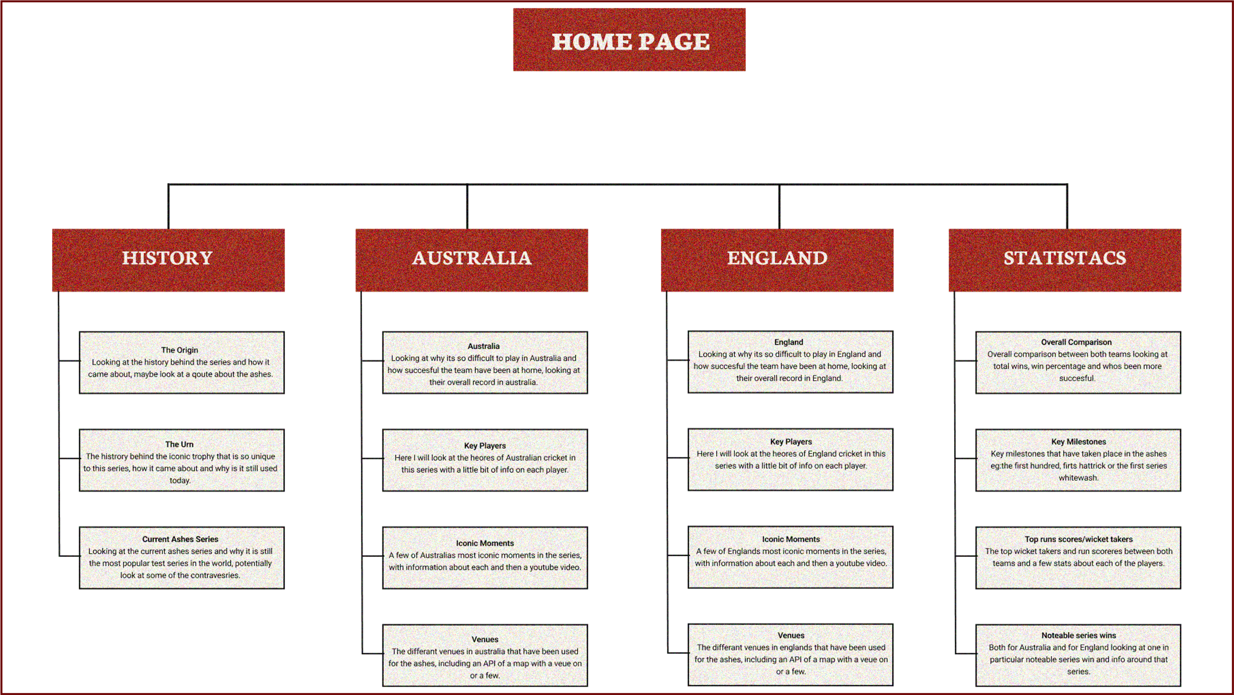
The start of the process started with the creation of a sitemap for the website, to gain a better understanding of what pages were needed, as well as the type of content was needed for each of the pages. This was a helpful step as it meant when I came to wire-framing I knew what was needed on each page so I could focus entirely on how it was laid out for a user like my persona carried out earlier on, this meant the focus was on the users experience instead of the content.
Website Sitemap
Low-Fidelity Wireframes
Next, I drew low-fidelity wireframes in order to explore layout possibilities quickly. These simple black-and-white frames helped test ideas for navigation, homepage structure, card layouts, and the flow of historical content without concern for aesthetics. This made it easy for rapid iterations to the design.
Medium Fidelity Wireframes
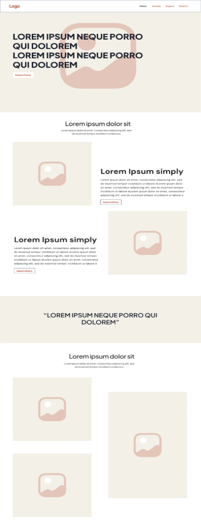
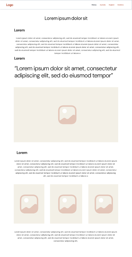
Next I worked on some medium fidelity designs as shown here, these contained more defined spacing, consistency of grid, typography hierarchy. They let me refine usability and make sure the design supported clear storytelling before adding visual styling.
Medium Fidelity Wire Frames

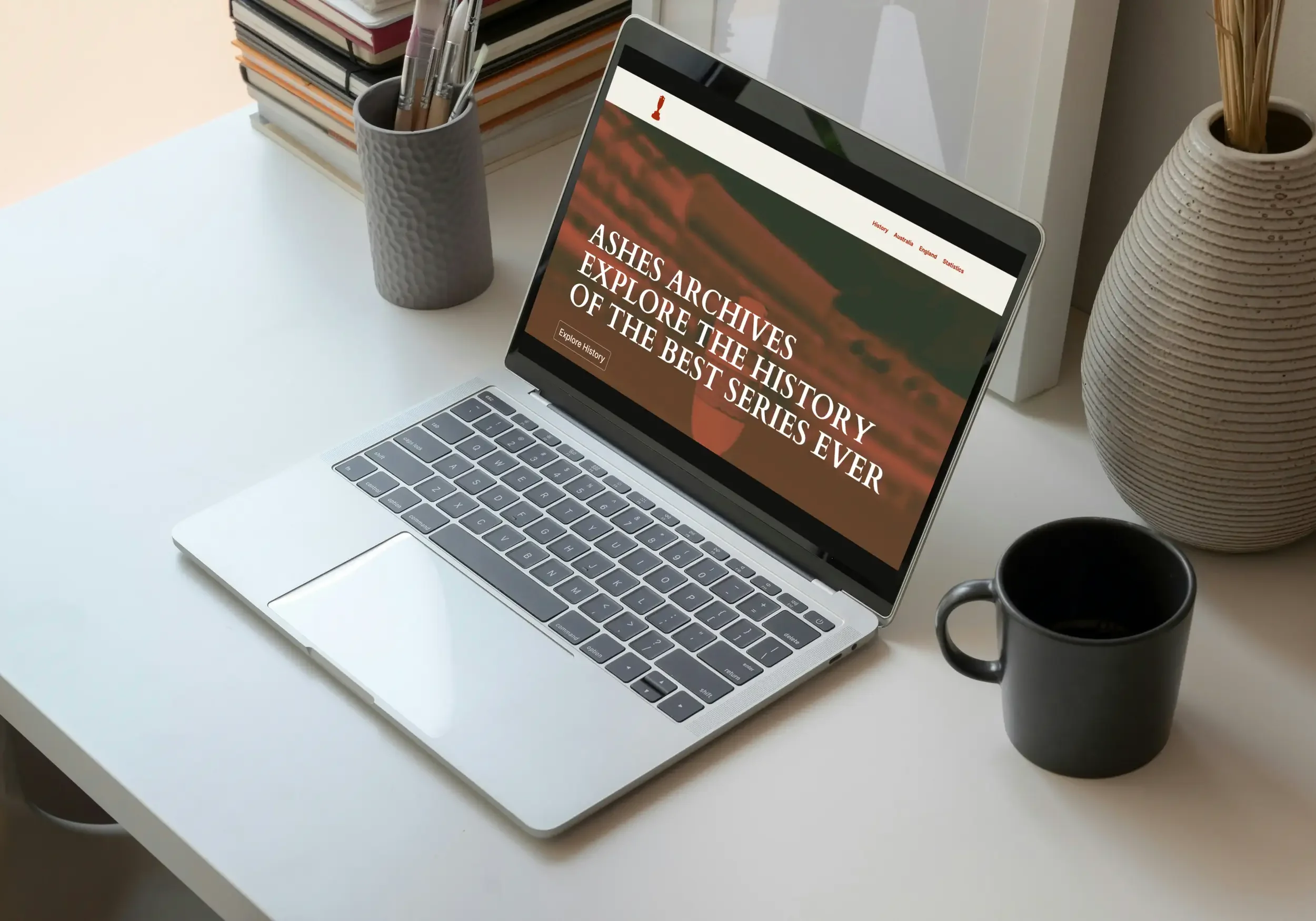
WordPress Prototype
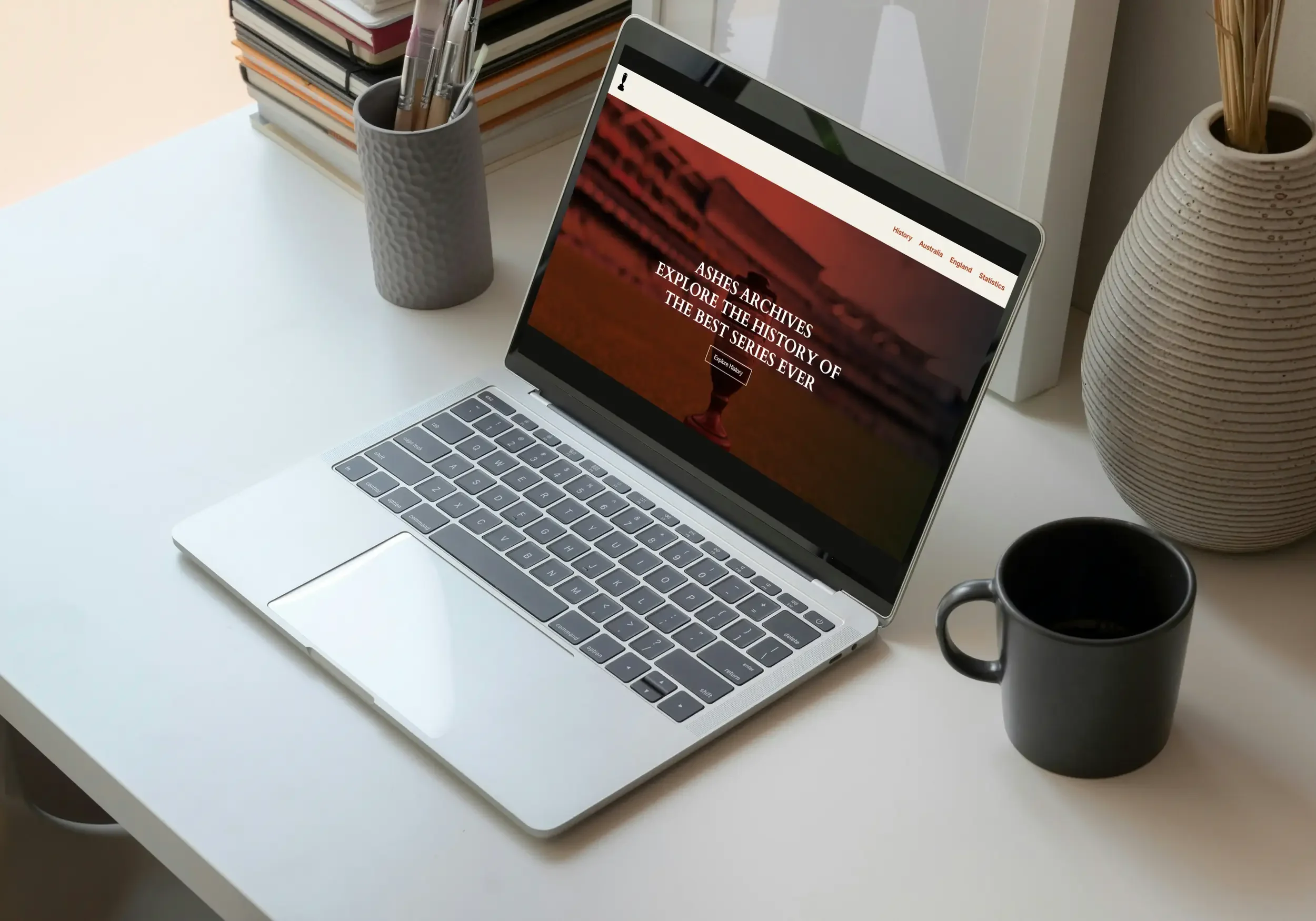
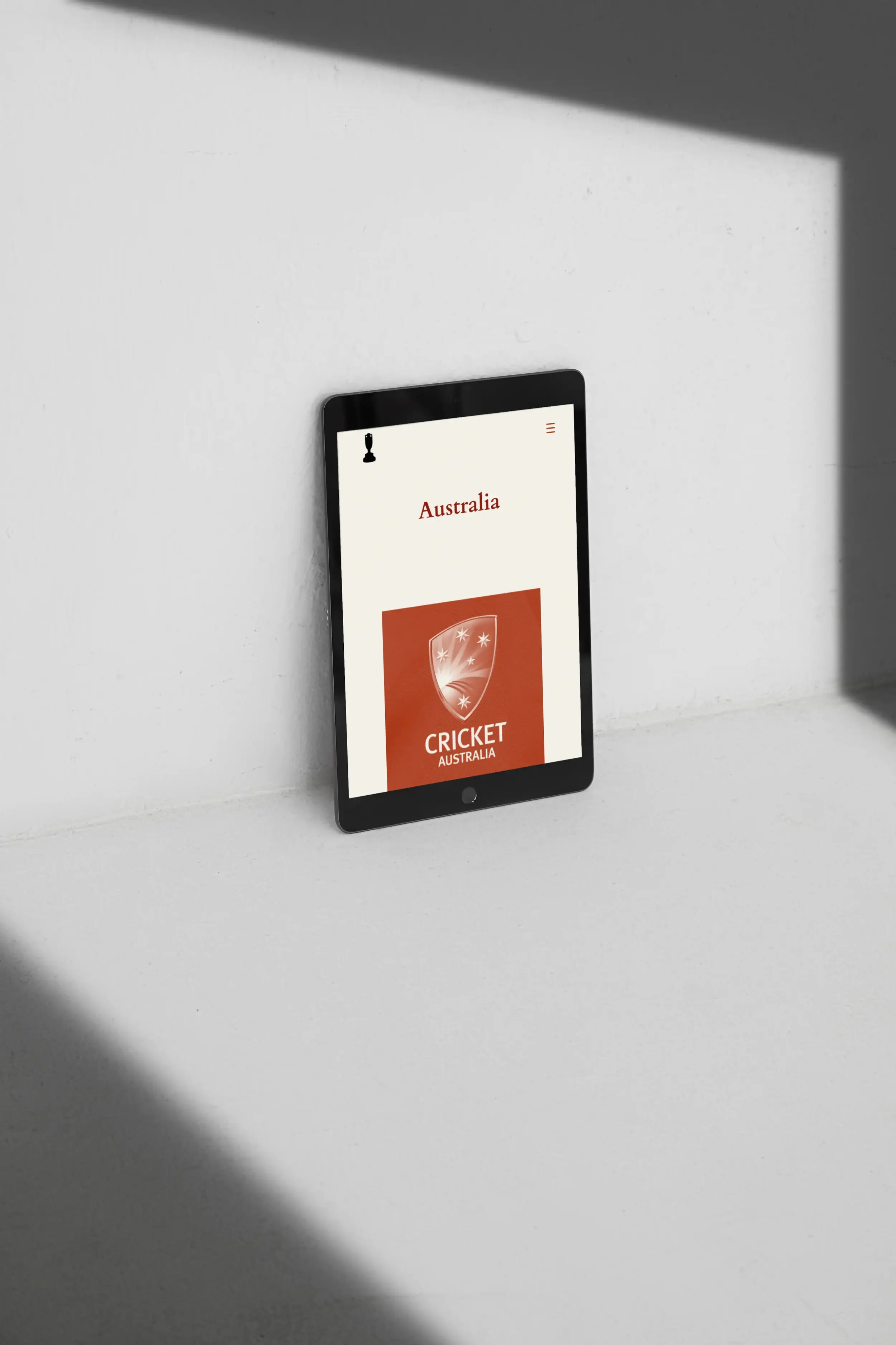
To move into a functional environment, I built a working prototype in WordPress. This version let me test real interactions: page transitions, scroll behaviour and responsive layouts. Using WordPress made it easy to test content volume and gather quick feedback with minimal development time.
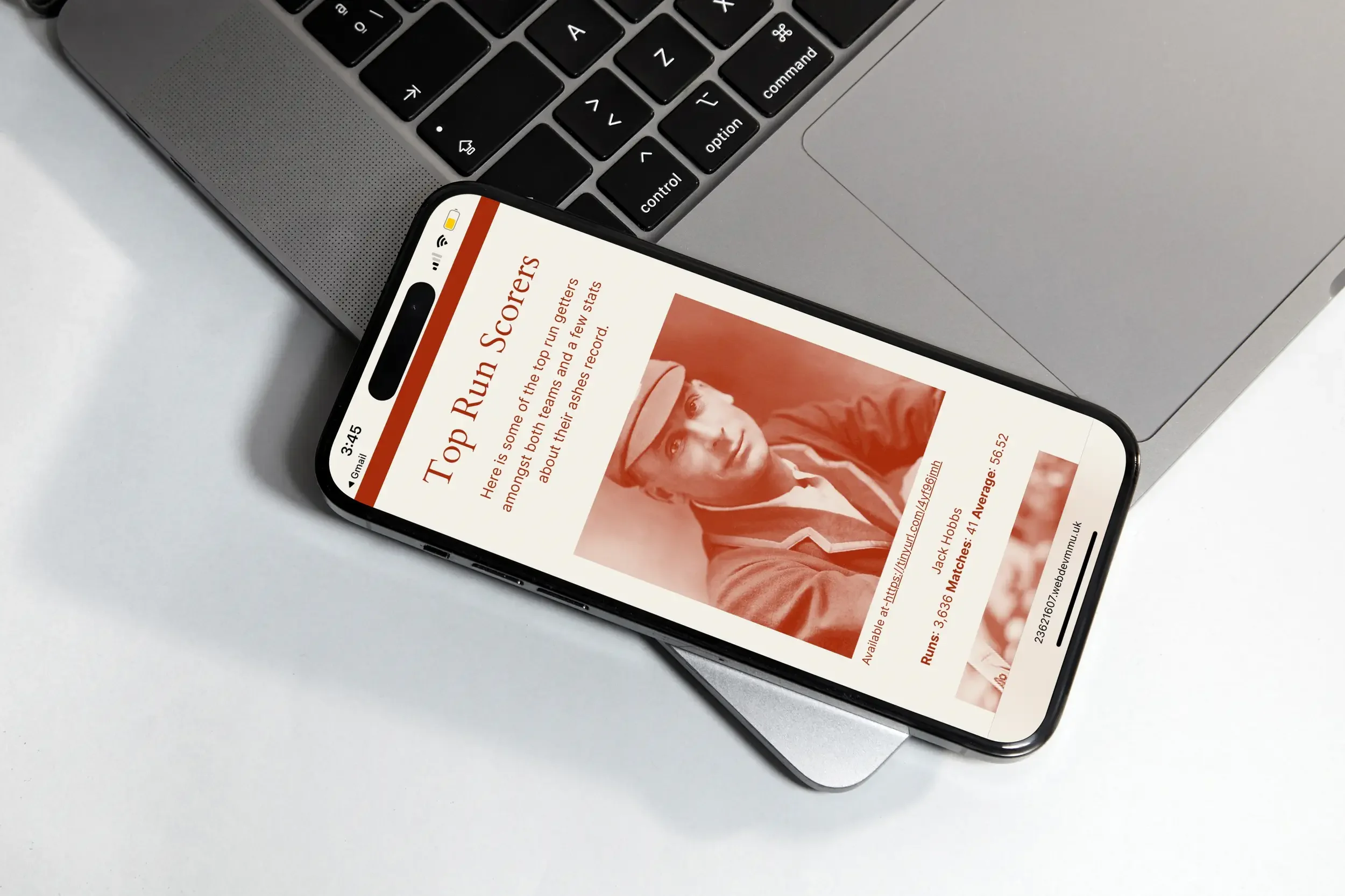
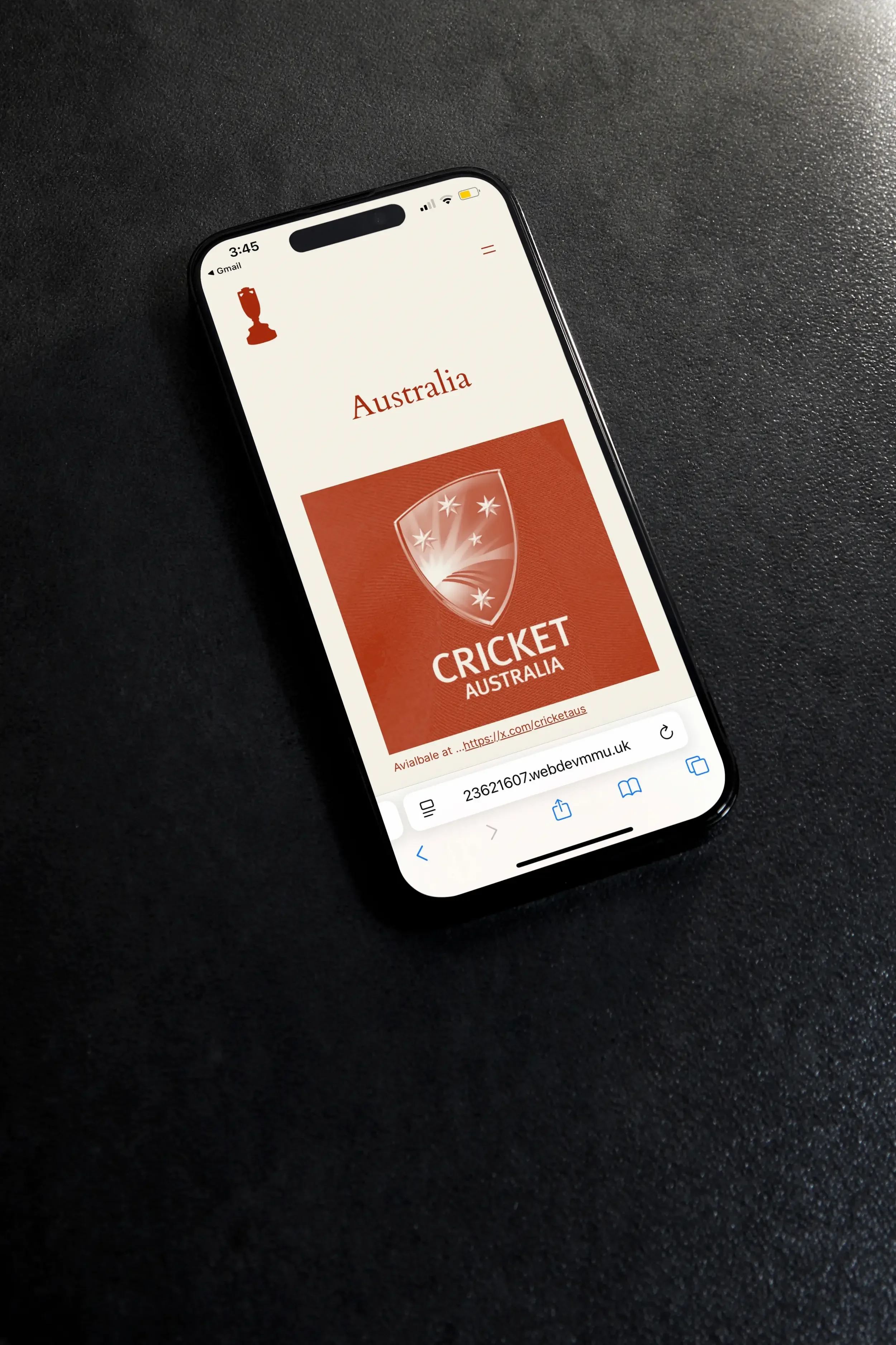
Testing the WordPress Site
Users tested the prototype by performing tasks like finding specified content, exploring a player's profile, and finding statistics. They also needed to edit some key things to ensure the it didn't affect the websites structure and layout. These insights directed the next step of refinement.
Design Iteration Stages:
The Outcome
The WordPress prototype effectively brought the wireframes into an interactive experience, where users explored the history of the Ashes by clearly navigating through structured content on responsive layouts. Usability testing revealed good engagement with the timeline and player pages, confirming that the core structure was working.
With WordPress, of course, came limitations-theme constraints limited the flexibility in layout, some interactions felt a bit rigid, and performance across devices varied.
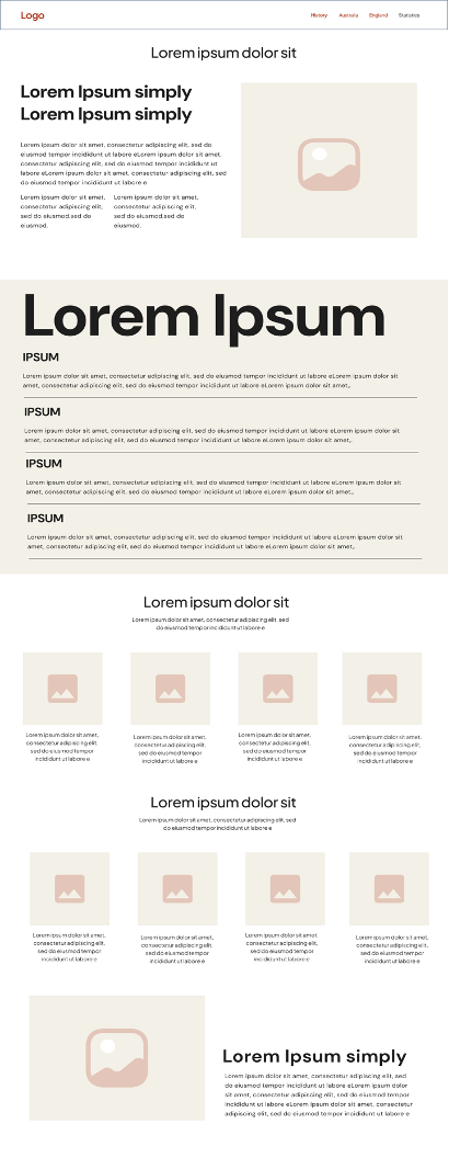
A short coded version in HTML/CSS followed, allowing better control over spacing and responsiveness, while slightly different in overall look it came with, cleaner, smoother, and more refined, different from the WordPress prototype in precision and feel altogether.
Coded Output