Portfolio Reflection

Overview

This Project titled “Working in a digital world” involves the creation of an industry ready portfolio website, LinkedIn, and a business card all showcasing strong user-centred design. The portfolio project is informed by a UX skills audit, which identified areas such as UX design with strong elements of Ui/ Visual design and Research as my stronger areas that should be showcased. 

Year

2025

Role

Ux Designer

Understanding The Problem

Mind map titled 'My Portfolio Ideas' with sections on colors, typography, and imagery ideas, including color palette swatches, font descriptions, and sample black and white image overlays.

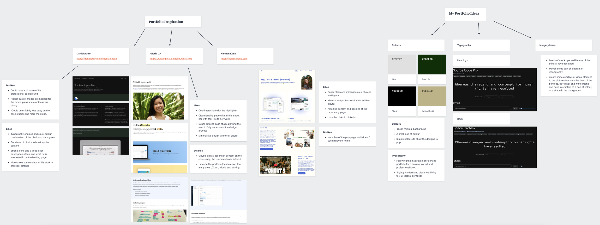
My Mood board includes inspiration from UX Portfolios, focusing on clean layouts, minimal colour pallets, modern typography and structured case studies. They included strong examples of personal branding and professional presentation. I then focused on my portfolio ideas from the examples, these choices reflected my approach of clarity, usability and research led designs.   

Tool Choice

Original Template (Adri)

Screenshot of a personal website homepage featuring a photo of a woman with curly hair, text introducing Adri, who helps small businesses and entrepreneurs create digital experiences, and a 'Work with Me' button.
Screenshot of a webpage titled 'Case Studies' featuring three project summaries in beige rounded boxes with black text. The projects are 'Collette Noll Interior Design,' 'Sofia Pazari Home Goods,' and 'Sauce & Slice Pizzeria,' each with a brief description and a 'View Project' link.
A woman with curly hair sitting with her chin resting on her hand, dressed in a black top and gray pants, smiling slightly. A form titled 'Let's Work Together' is on the right side with fields for name, email, dropdown menu, subject, and message, along with a submit button.

I chose Squarespace as my tool for creating a portfolio due to a quick turnaround. I wanted to have something I could work from rather than start building the site from scratch, which would have taken longer. Squarespace provided me with the user-friendly interface to concentrate on making decisions about design and not technical ones. The template used was called “Adri”, with a very neutral layout and minimum visual identity. This made it a strong starting point. I reorganized navigation, revised the page layouts, and adjusted typography and colour so that the content within the portfolio is reflective of my branding and presentation.

The Process

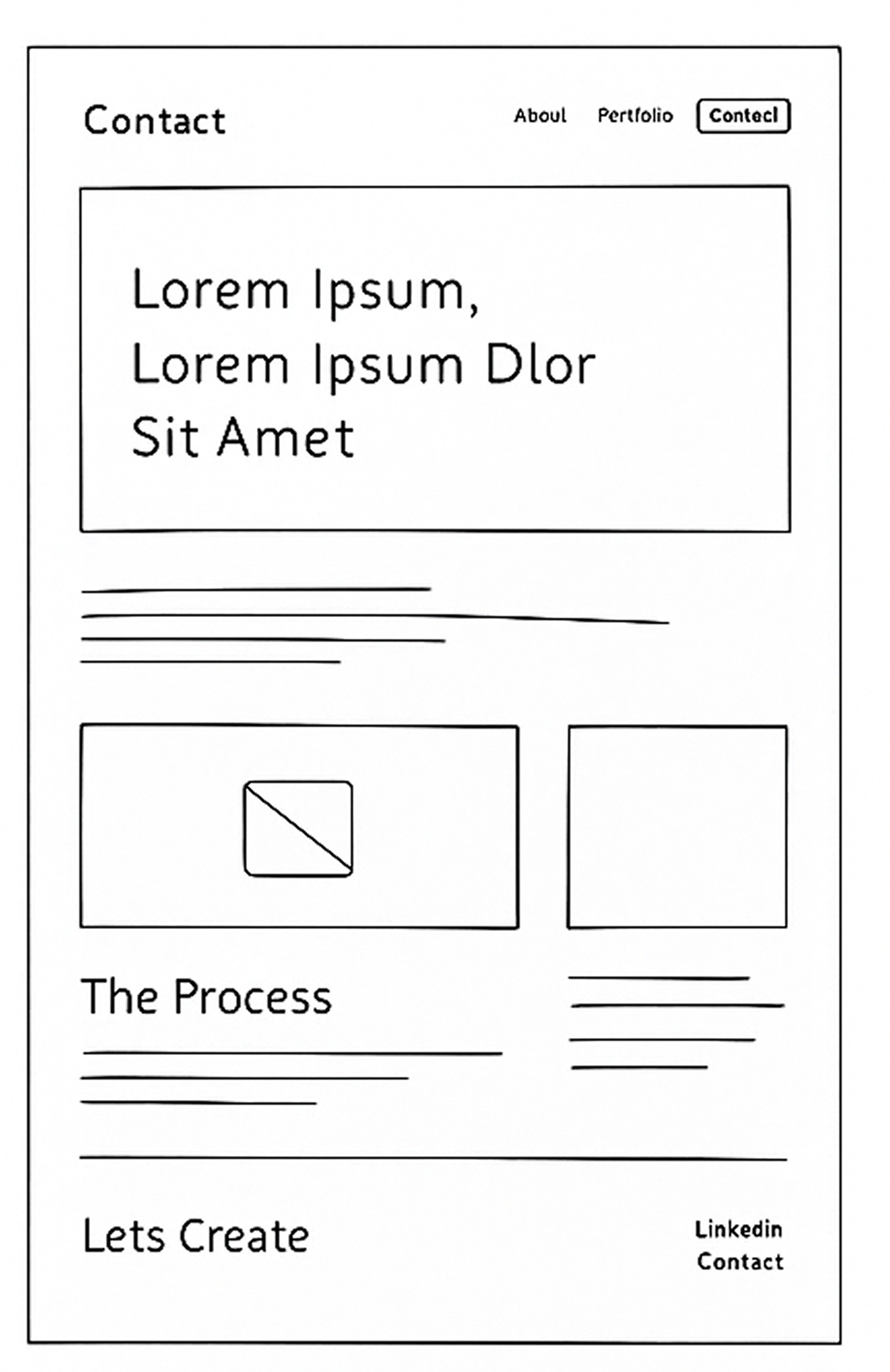
Low Fidelity Wire Frames

Webpage layout for a portfolio website featuring sections for about, contact, a portfolio overview, case studies, experience, and contact prompt. Placeholder images and text are included.
A webpage layout titled 'Case Studies' featuring four placeholder images labeled 'Case Study' or 'Case One,' with space for descriptions underneath. Also includes sections for 'Results & Takeaways' and a button labeled 'Contecl' in the upper right corner.
Wireframe sketch of a website about page, featuring a large banner image, heading 'Lorem Ipsum, Lorem Ipsum', subheading, three smaller images with captions, and navigation links for 'About', 'Portfolio', and 'Contact'.


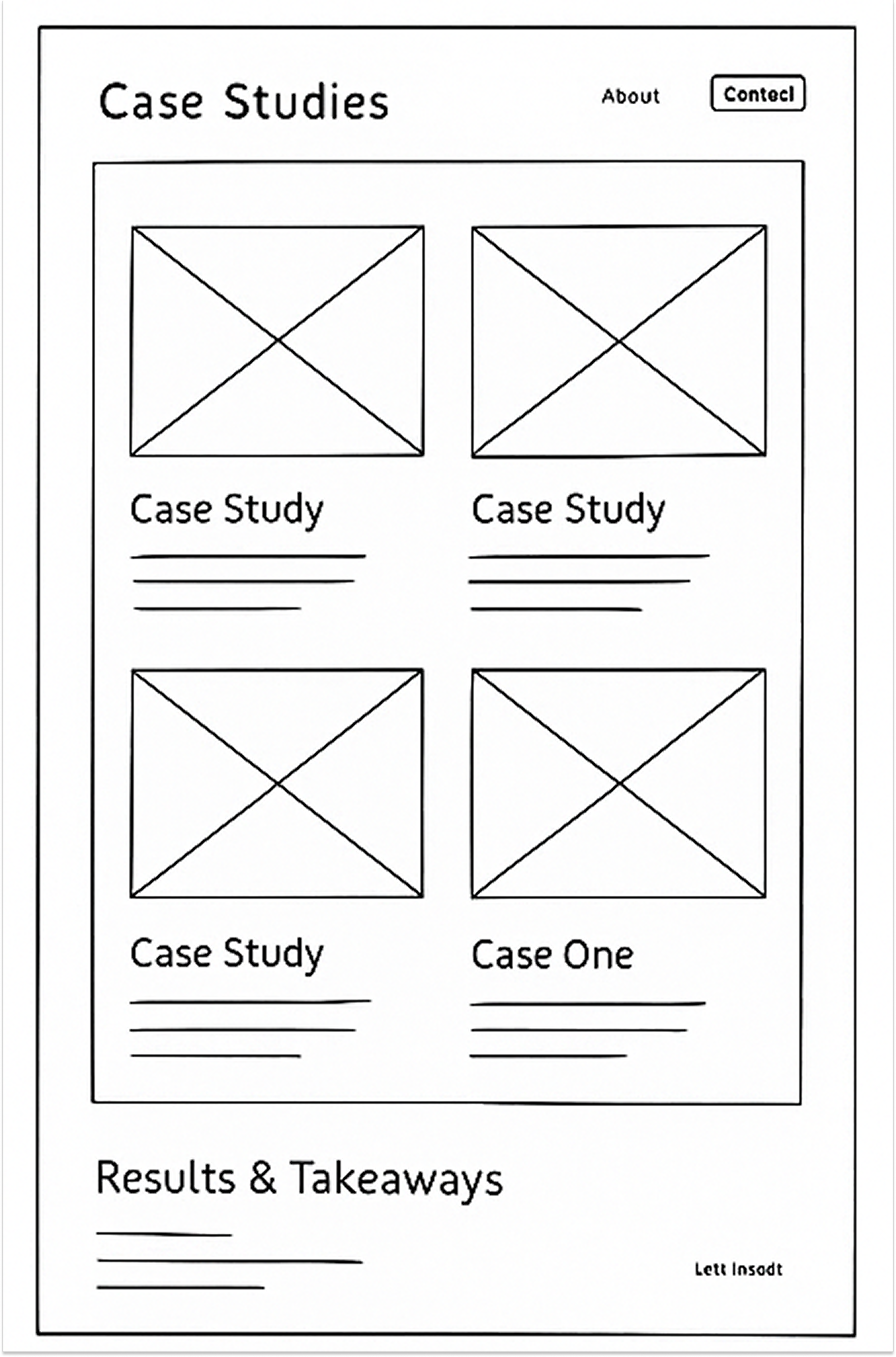
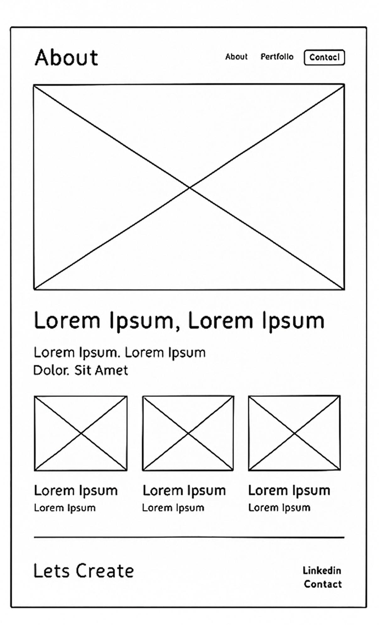
First, I did some low-fidelity wireframing to rapidly iterate and make rapid changes to the design. Once I had defined the core structure of the design, I did some medium-fidelity designs to refine spacing hierarchy and content placement. It felt like an overall effective process.

A wireframe sketch of a webpage layout with a contact page title, navigation links for About, Portfolio, and Contact, a headline with placeholder text, and sections with image placeholders and text snippets.

Early Sketches (Wireframes)

Medium Fidelity Wire Frames

A website layout with a header containing a logo and navigation menu, main section with placeholder text, case studies section with four image placeholders, an experience section with three place descriptions, and a footer with contact information. The design uses gray, white, and black colors, with some green icons.
Website layout with placeholder images, navigation menu, and text sections, featuring a logo, about me, portfolio, contact buttons, and social media links.
Screenshot of a professional document layout with a header containing a logo, menu options ('About Me,' 'Portfolio,' 'Contact'), and a 'Contact' button. The main content includes headings like 'Lorem Ipsum, Lorem Ipsum Dolor Sit Amet,' 'Understanding The Problem,' 'The Process,' 'The Outcome,' and 'Results & Takeaways.' There are placeholders for images throughout as indicated by icons, and text sections with lorem ipsum filler. The footer features a logo, name 'Sean Manning,' social media links, and a 'Let's Create' slogan, along with a 'Contact' button.
A web portfolio page with a header featuring a logo, navigation links (About Me, Portfolio, Contact), a main section titled "My Portfolio" with placeholder text and images, each accompanied by a button labeled "View Case Study," and a footer with additional contact links and social media icons.
A web page layout with a navigation bar featuring a logo, 'About Me', 'Portfolio', and a contact button. The main section contains a large heading with lorem ipsum text, a placeholder image icon, and a contact form with fields for name, email, interest, and message, along with a submit button. Below the main section is a footer with a logo, the designer's name 'SEAN MANNING', a slogan 'Lets Create', and links to LinkedIn and Instagram, with a contact button.

Style Tile

I created a defined design style-tile that outlined my usage of my logo, primary and secondary colors, heading and body typography, and image styling. This developed directly from my initial moodboard, which set the tone, color palette, and overall visual direction. Refining these elements allowed for consistency, accessibility, and a strong visual identity throughout the portfolio.

Design template showcasing logo options, headings, body text, color palette, and image styles, including a grayscale and a black and white dice image.

Early Design Work

My initial designs were focused on changing the template page structure navigation, typography and colours to fit my style tile and design choices of the wireframes. I slowly reduced until the template almost had no influence. I also set up my LinkedIn and started work on my business card to try maintaining the same feel across.

Profile page of Sean Manning, a UX designer and researcher, with a circular profile picture showing a young man smiling, wearing a green sweater and a silver cross necklace, against a black background.
Business card for Sean Manning, UI/UX designer and researcher. Green background with large initials 'SM' and a QR code with an arrow pointing to it. Text includes his name, profession, and a prompt to check out his LinkedIn.
Business card for Sean Manning, includes phone number 07864 815 485 and website seanmanningux.uk, with initials SM in a circle.

Feedback

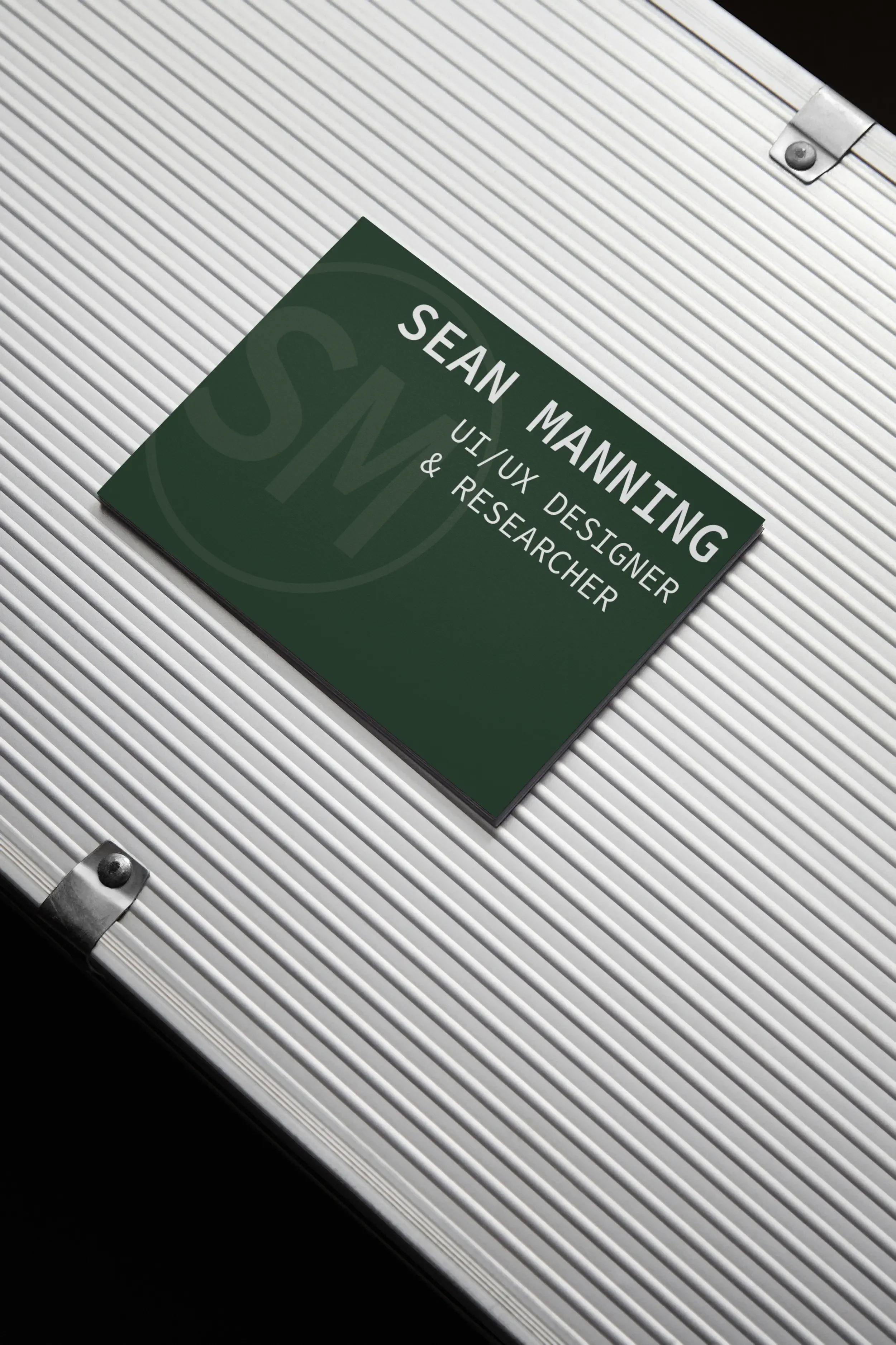
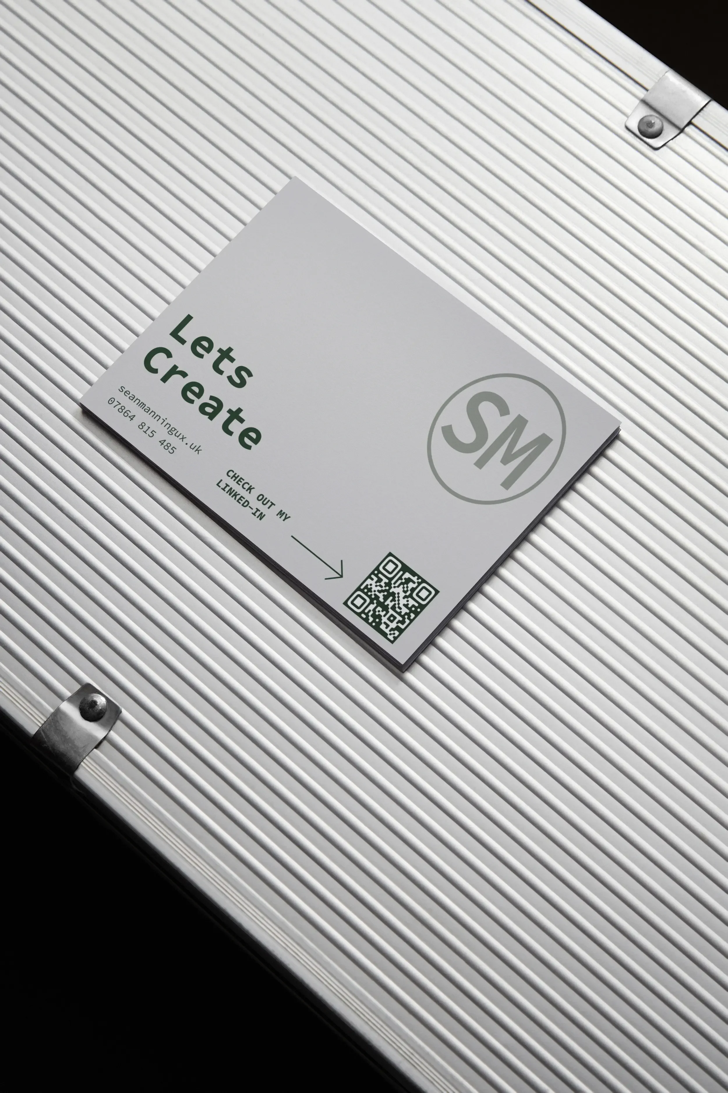
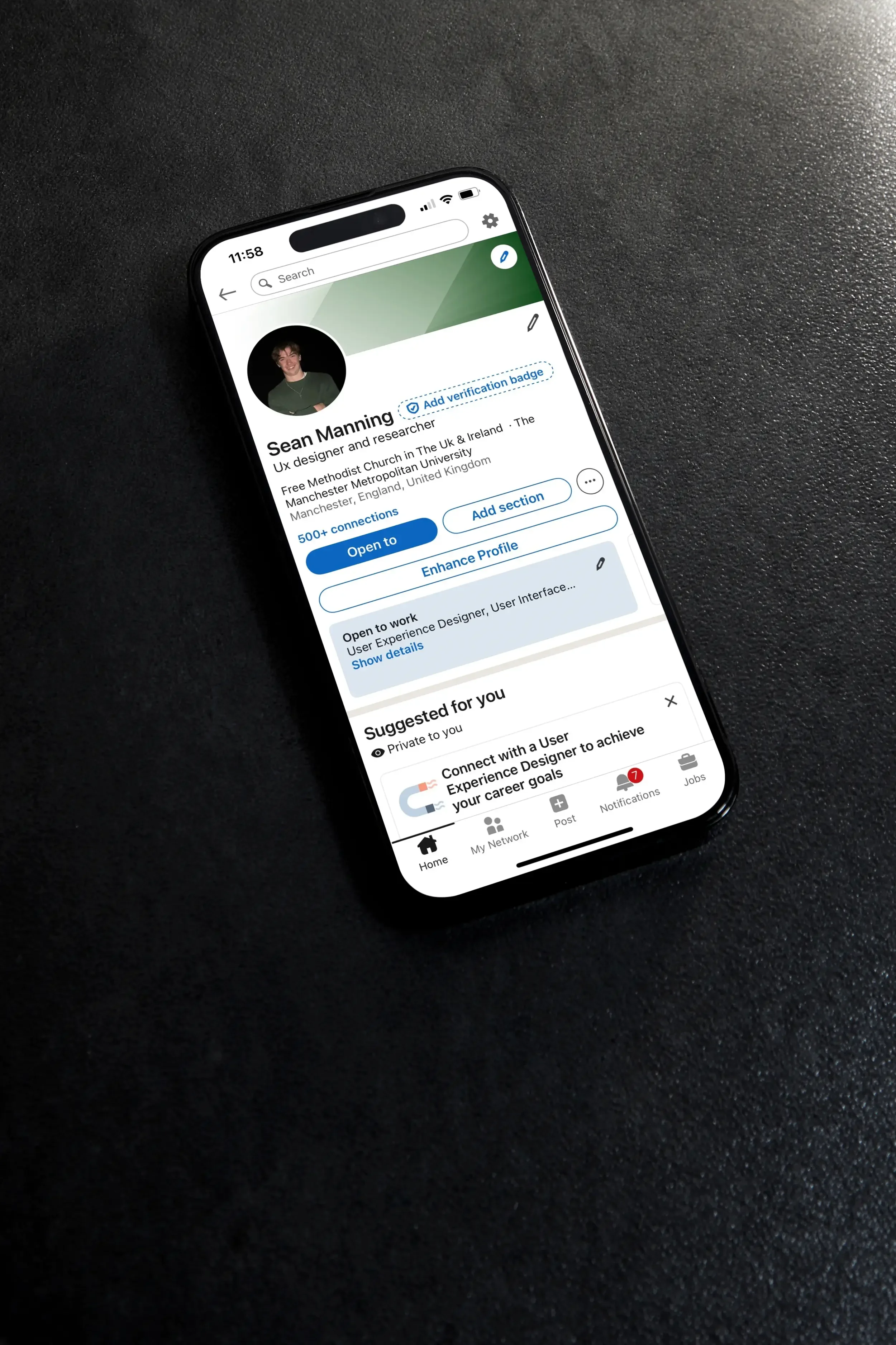
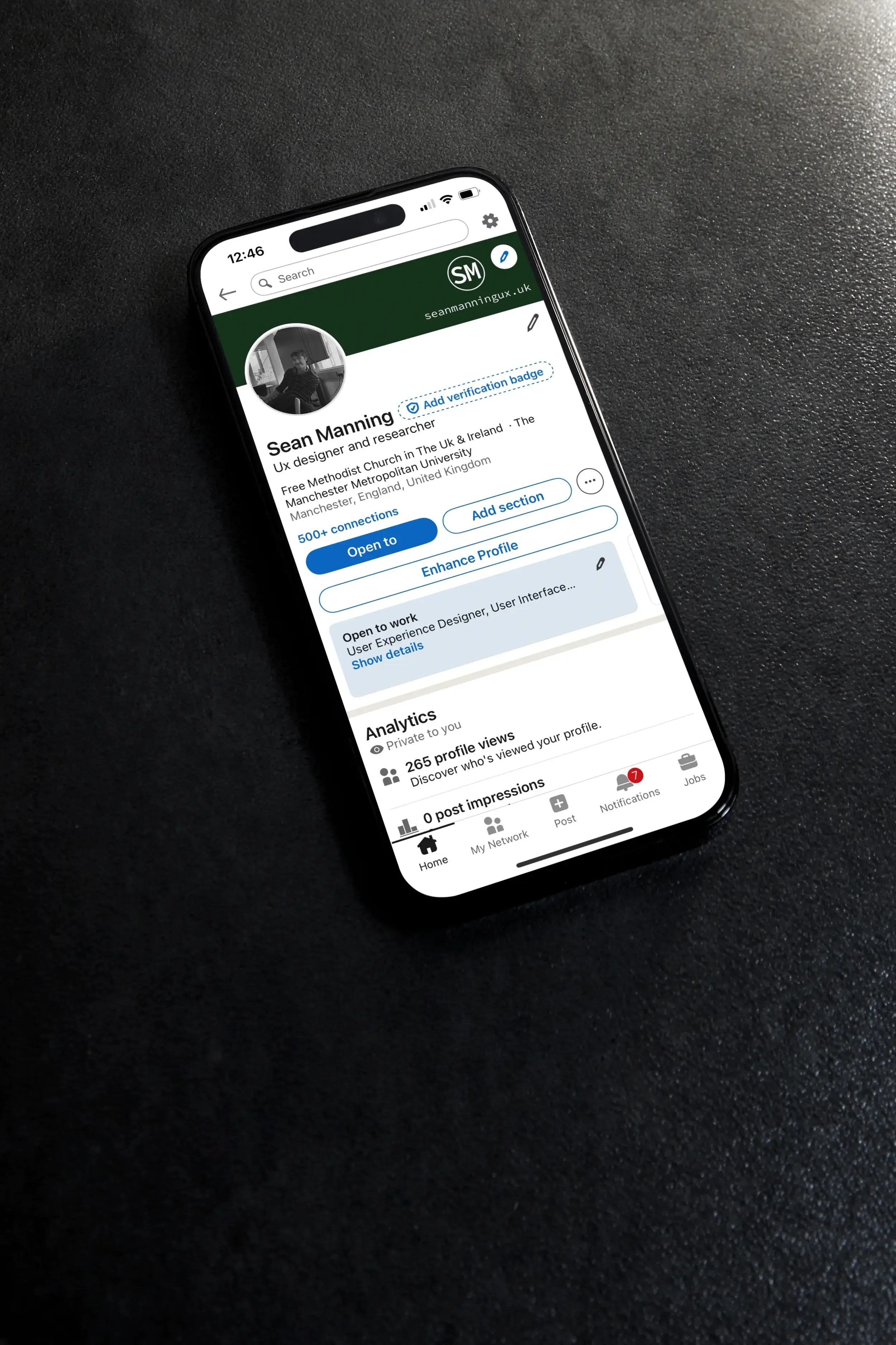
Peers identified inconsistent branding between my business card, LinkedIn, and website; dense text and limited visual interaction. These same points were reinforced by a industry professional I connected with on LinkedIn : clearer hierarchy, stronger visual storytelling, and more engaging presentation of prototypes.

Lesson I learned From The Feedback

In this process, I learned how important it is to have the same branding throughout all the platforms and balanced text with engaging visuals. I enhanced clarity in the sections, readjusted layouts, refined my LinkedIn+ Business Card identity, and added a prototype video to demonstrate just how my mock-ups function, making it clearer and more engaging.

Final Business Card Design

Business card with dark green background and white text that reads 'Sean Manning, UI/UX Designer & Researcher', placed on a silver, ribbed surface.
A white card with green text that says "Lets Create" and a circular logo with the initials "SM" on a silver, ribbed surface.

LinkedIn Before And After Feedback

Smartphone displaying a LinkedIn profile of Sean Manning, a UX designer and researcher, on a dark textured surface.
A smartphone displaying a LinkedIn profile page of Sean Manning, a UX designer and researcher, on a black textured surface.

Final Reflection

I improved the website based on feedback with a cleaner layout, clearer navigation and stronger branding throughout. I also responded to the feedback by improving the hierarchy and reducing clutter. Optimising the images was a tricky task on the Squarespace template and is a area for future development.

Open laptop on a wooden desk displaying a personal website for Sean Manning, with a black and white photo of a man sitting at a desk in a modern office setting. The desk has a white ceramic mug with a spoon, a stack of books, a silver potted plant, and a wooden container with black pencils, with a window in the background.
Smartphone on a stand displaying a webpage titled 'Ashes Archives (CMS | WordPress | HTML & CSS Project)'. The webpage includes sections labeled 'Self Directed Project' and 'Overview' text.
A smartphone displaying a form with fields for name, email, sign-up preferences, a dropdown menu, and message submission.