
Toast Brewing (Research + Prototyping Project)
Self Directed Project
Overview
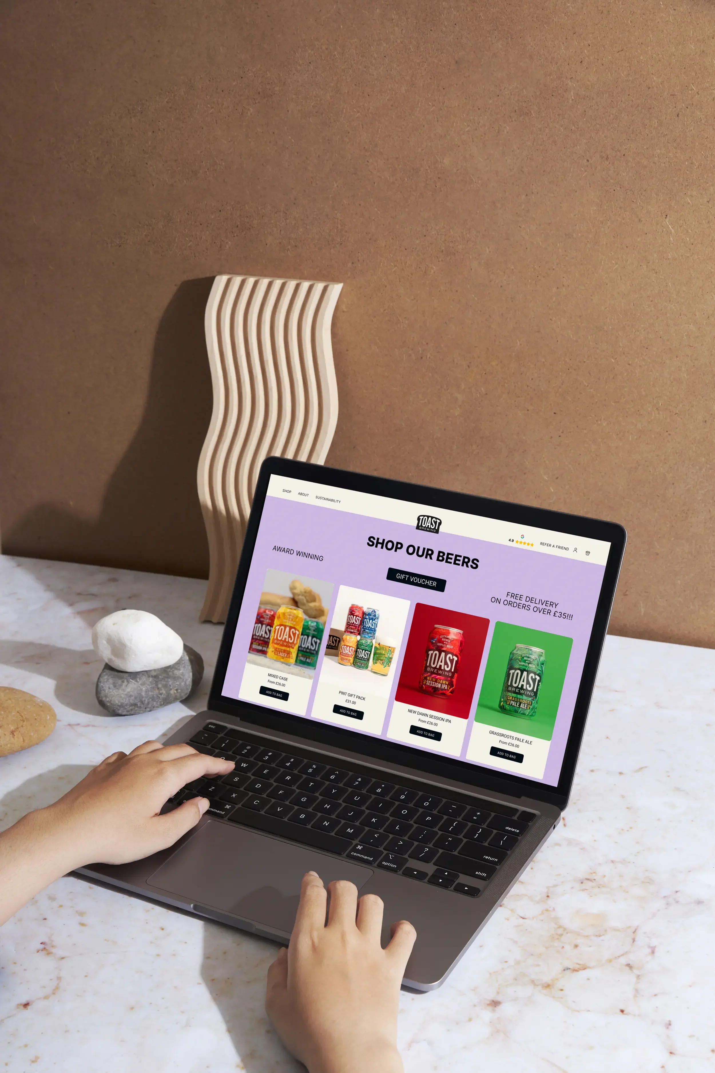
This was a research and prototyping project that had the aim of improving the checkout process of Toast Brewing's website ( a sustainable craft beer company ). It focused on users pain points during the checkout process and how the user journey could be improved to match Business needs and KPI’s of Toast Brewing.
Year
2024
Role
UX-Researcher, Ui Designer
Understanding The Problem
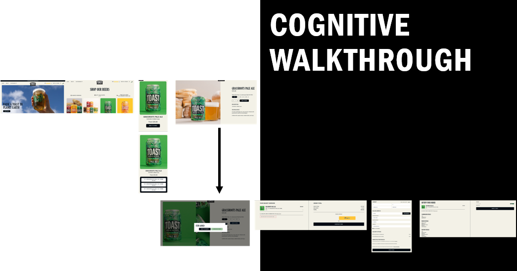
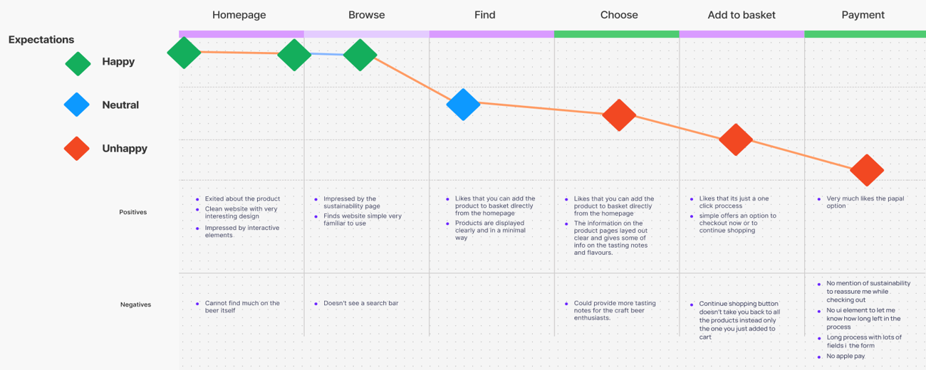
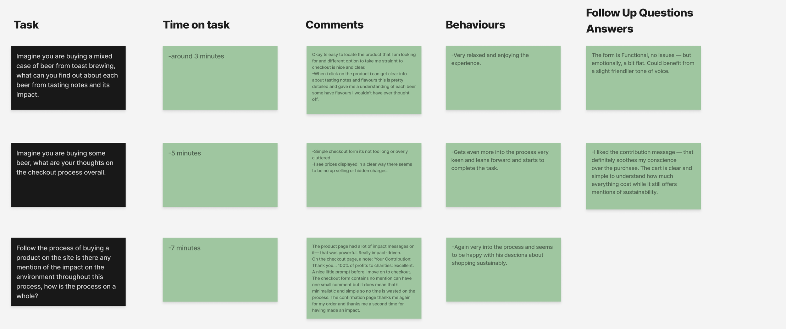
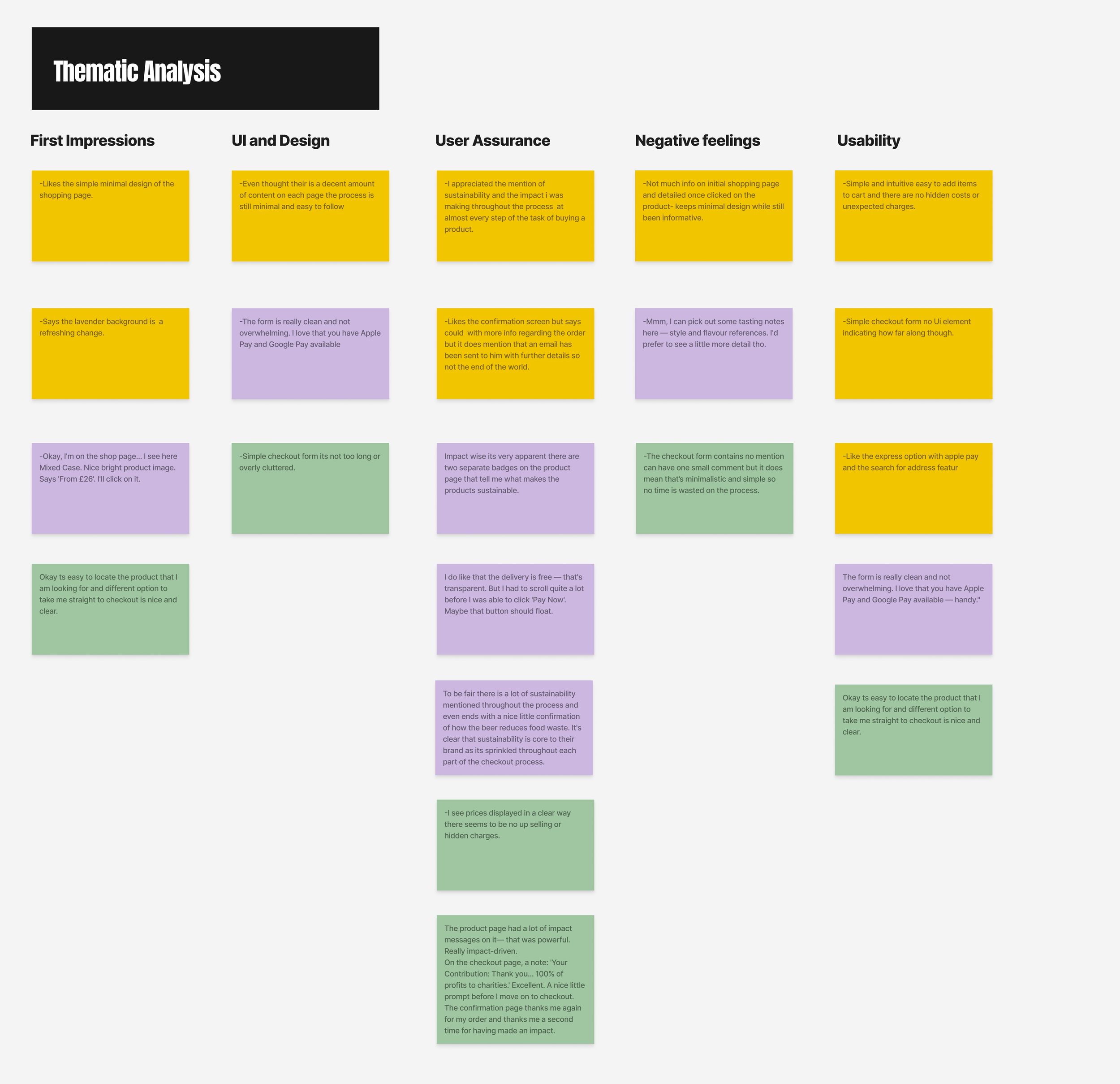
To better understand the users pain points and the current problem in the checkout process I used a variety of research methods, these included personas, storyboards, user journeys, surveys and cognitive walkthroughs. These allowed me to address key concerns been that the checkout process had too many steps, not much re assurance about the slightly higher price due to this been a sustainable product and the ;ack of a express checkout with apple pay or googlepay.
The Process
The redesign of Toast Brewing’s checkout process put the User experience in line with the core mission of the company: to brew great beer while fighting food waste. In its pursuit, the process had to optimize both usability and Key performance indicators, with every design decision supporting sustainability, sales growth, and customer trust.
First I had to understand the business needs of Toast Brewing's which revolved around increasing total sales, improving checkout completion, and reinforcing its sustainable brand identity. The new design was built to reinforce two KPIs:
Cart Conversion Rate: This improves due to reduced friction through fewer steps, more honest pricing, and a simpler checkout layout.
Order Frequency: Enhanced by a sense of loyalty and purpose-sustainability messaging at checkout to nurture repeat purchases.
Supporting UX metrics included time on task, error rate, and abandonment rate to give measurable indicators of usability and the efficiency of flow. These metrics ensure a balance between business growth and positive user experience.
Business Needs + KPI’s
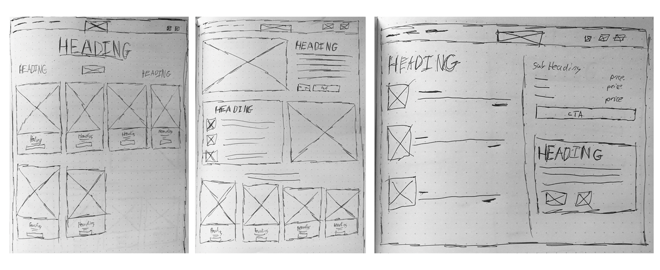
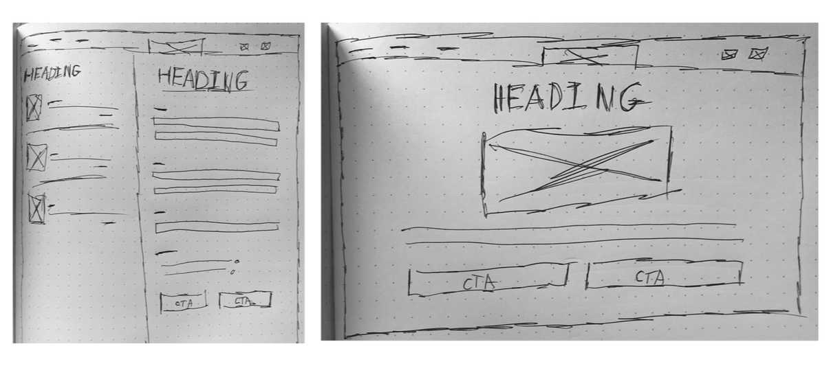
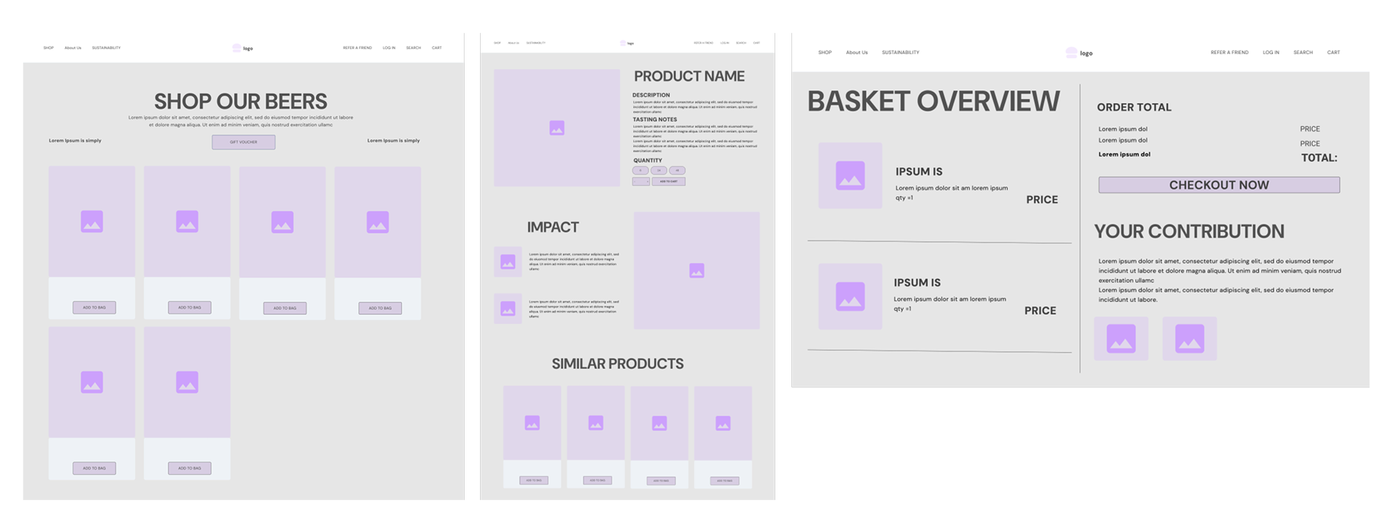
Low Fidelity Wire Frames
Medium Fidelity Wire Frames
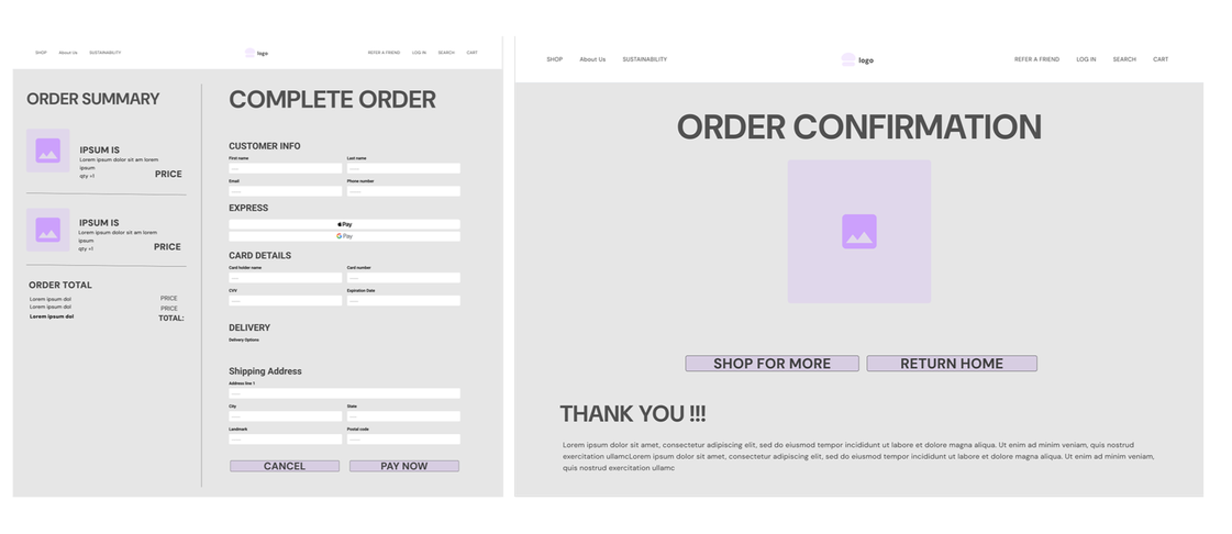
Low-fidelity wireframes: Defined the basic checkout structure, prioritizing simplicity of flow and clarity of tasks.
Medium-Fidelity Wireframes: Created page layouts for the product, cart, checkout, and confirmation stages.
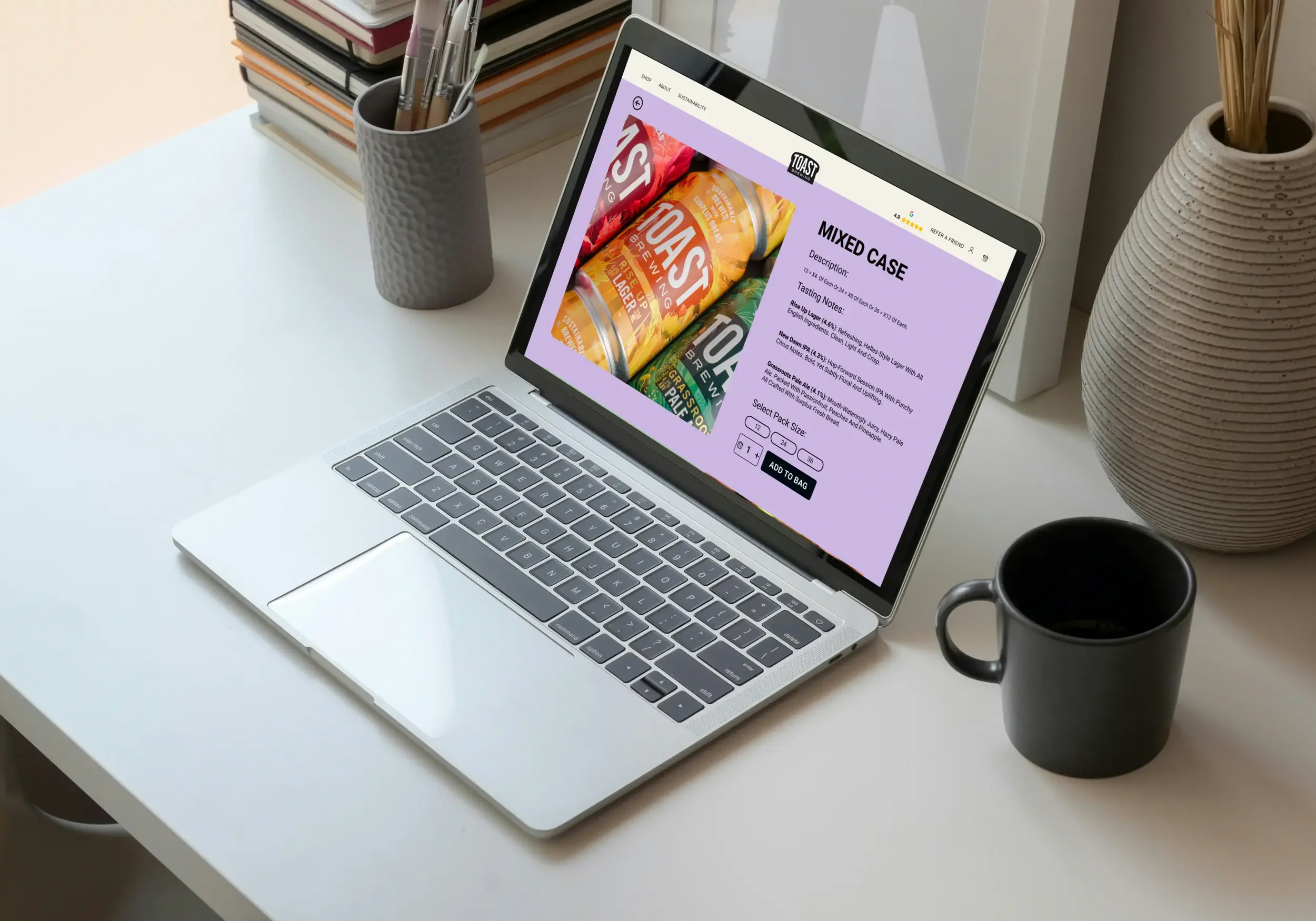
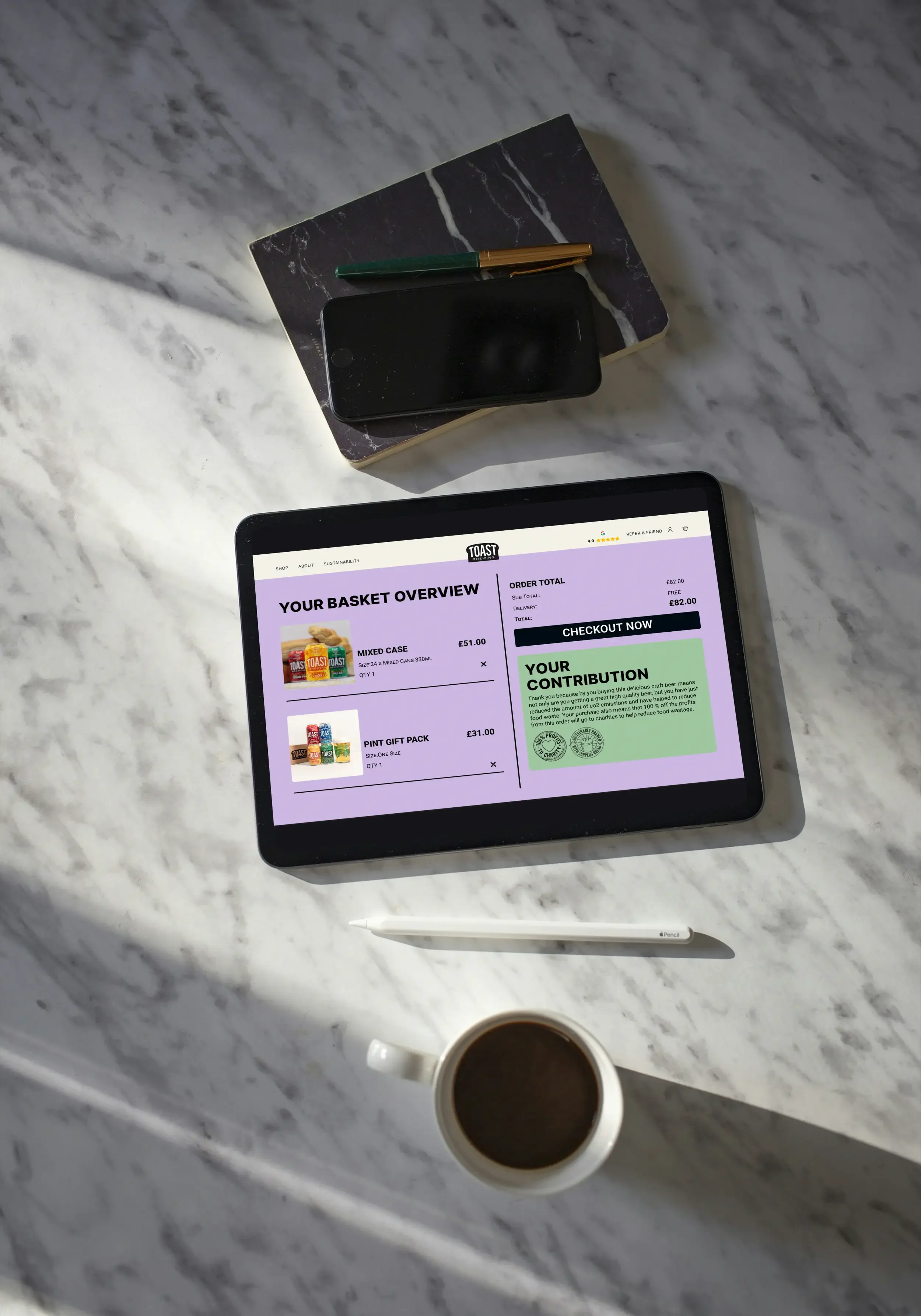
High-Fidelity Mockups: Integrated Toast's branding, visible sustainability badges, and a minimal, trustworthy interface.
User Testing Plan:Test the Prototypes and gain feedback for further design iterations.
Low-Carbon Design: Made use of soft, energy-efficient colors, minimal images, and standard fonts to support eco-friendly digital design principles.
Prototype: Delivered an end-to-end, interactive checkout experience that showcases efficiency, clarity, and consistency with branding.
Design Iteration Stages:
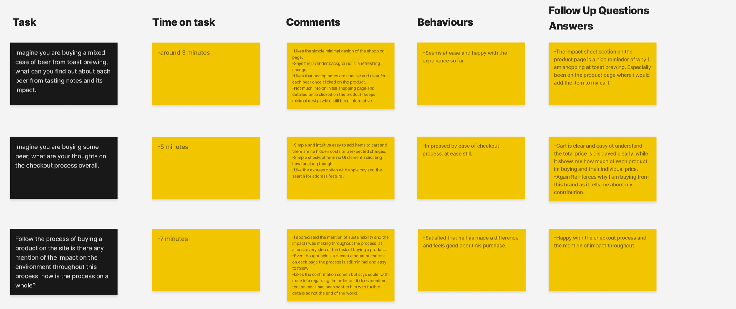
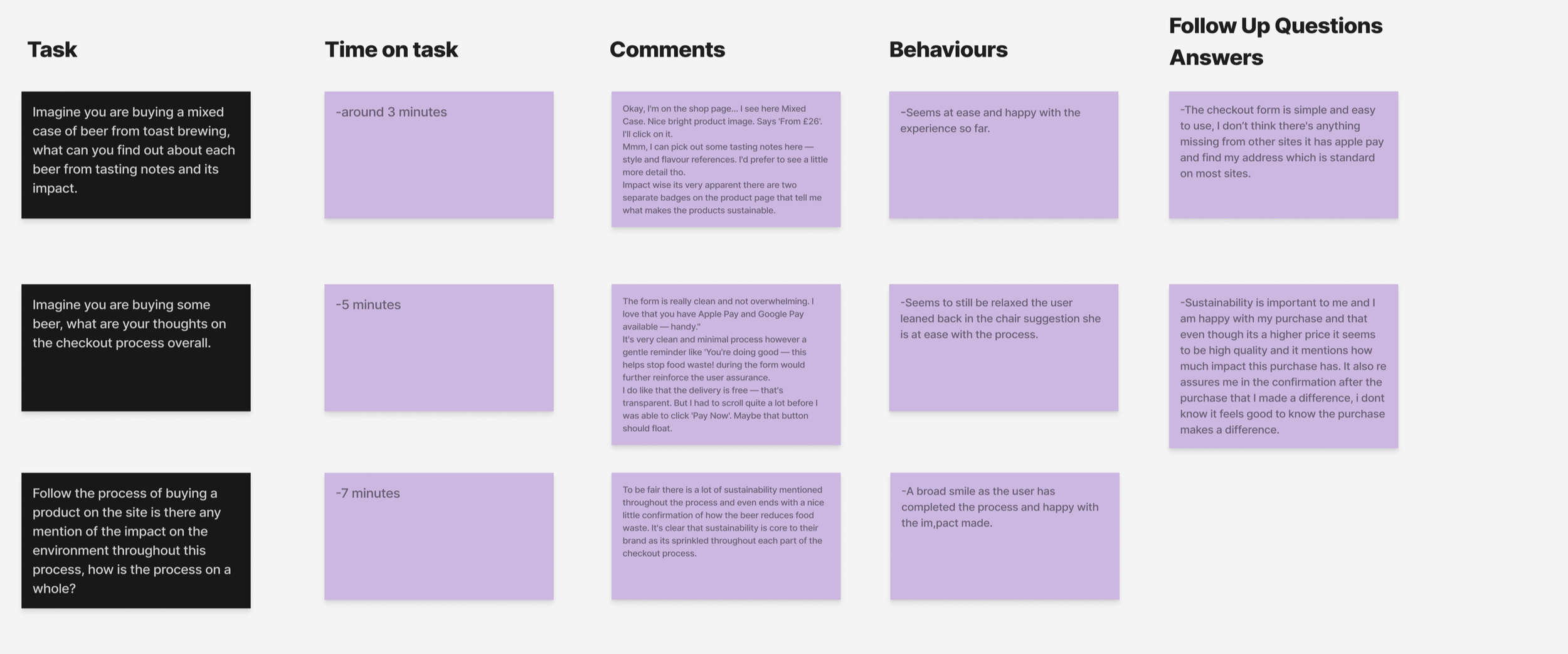
Testing Results
The Outcome
Users reported a smoother and more transparent experience with clear visual cues of where their contribution to Toast's mission was. The simplified flow resulted in less frustration, and their trust improved while reducing drop-offs during checkout.
From a business perspective, the improvements directly supported the brand's key KPIs:
Higher cart conversion rate through reduced abandonment and faster task completion. Drove an increase in order frequency, developing emotional bonding with the brand through sustainable design. In all, the redesign improved usability and ethical engagement to help Toast Brewing forge deeper relationships with customers and support its mission to make sustainability simple, seamless, and rewarding.